Short films tend to explore issues within society, for instance domestic violence. It seems this is because there are less layers of narrative, which allows the producer to present his message so that its ‘to the point’. For ‘A long way from home’, I chose the content to be of a contemporary issue. I looked at what was happening in Afghanistan at the moment, and wanted to look at the effect was has on soldiers. I thought it would be easier to put this across without much distractions from sub-plots or layers.
Due to the lower budget invested in making Shorts compared to feature length films, I found it much simpler to develop the forms and conventions of ‘real’ Shorts. The production, because of the low budget involved in the project, may then not be interpreted as being realistic, though it is in a semi-documentary form and so may under take the conventions of this genre. With this in mind, the settings used within my media product coincide with the tone of the film and its conventions. It was hard to organise my actors and location. I had to mainly use my school as a location for settings such as a kitchen, which may challenge the concept of realism. When Helen is being interviewed, she is meant to be in her kitchen/ dinning area with a cup of tea talking, however due to circumstances I had to use the café whilst everyone were in their lessons. I believe, however, that this scene still works. I also chose to show shots of mundane life, for instance when Helen steps out of the bathroom. The most realistic of interviews in the film, I feel is the one with Jack. This was filmed in a pub and all the non-diegetic noise is real from everyone else that was there.
Some of the main forms and conventions of film posters could include: A large title which attracts the eye, bold colours which stand out from the background, intriguing picture which would attract viewers to the film, persuasive language which might persuade the viewers to go and see the film, using the main character's name for promotion, and the certification to ensure that the right type of people are watching the film. A successful film poster will accomplish attracting the target audience and persuade them.
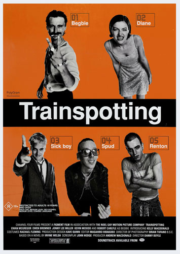
This poster of ‘Trainspotting’ has a bright and colourful orange background, with everything else on the foreground black or grey tone except from the white title which stands out against the rest of the content. They use the characters to intrigue the audience to watch the film, it instantly shows you its set in the 80s ‘sex, drugs and rock &roll’ era simply through the characters.
One way in which my film poster challenges these forms and conventions is due to the fact that the actors within my film aren’t well known; they could not be the main attraction and so are not at the forefront of the poster. However, I had decided to put a picture of James Kennedy, the lead actor, a close up of him looking morose as he looks down. He is in his uniform and so I believe that introduces the concept of 'A long way from home'. I chose to manipulate the image and added a solarized effect (a bit like night vision- which would possibly have been used in the army) but changed the colour to black and white. The background colour is grey which then means the image stands out from the poster. I kept the text simple, only putting the title of the film, my name as its creator and 'coming soon'. I did not create a tag line as commonly used on posters as I did not feel it needed it, as they often create a sense of fear or danger in specific genre films. It also seemed to me that those that would fit my film would come across perhaps as "cheesy" or cliché.
Film reviews must include the main plot and a verdict for the film along with a rating; they must be eye catching with pictures so that the reader chooses to read the article in the magazine. The magazine layout itself must coincide with a house theme; its colour scheme musn’t be too bright and yet be colourful enough to attract attention. I chose to use colours which reflected the theme of war and the army; there is the picture of James Kennedy in a army uniform in the foreground and the background starts with a light cream colour from the left hand side getting darker across the page. These colours reminded me of a desert, like when they were fighting in Aghanistan.
How effective is the combination of your main products and ancillary texts?
The combination of my short film with its poster and magazine review is very effective as the ancillary texts are used as promotional purposes for ‘A long way from home’.
Film posters, were merely meant to promote and entice viewers to come to the local theatres that were screening the films. Ironically in the early days of movie making actors were not usually depicted on the film posters. The title of the film and the producer and directors names were usually the attraction until Hollywood realised that it was the actors who brought in the viewers. It was at that time that the stars of movies were then plastered on each poster giving life to a new era in the film industry. It usually contains an image with text, though this has evolved over time from image-free posters through to the highly visual digital productions of today. The text usually contains the film title in large lettering and often the names of the main actors. It may also include a tag line, the name of the director, names of characters, the release date, etc. Film posters are displayed inside and on the outside of movie theaters, and elsewhere on the street or in shops. The same images would appear in a film exhibitor's pressbook and may also be used on websites, DVD-packaging, flyers, advertisements in newspapers and magazines.
Film reviews in magazines reach a huge demographic, depending on the status of the magazine and the type of films they tend to advertise. If that magazine’s audience depend entirely on their review of a certain film before seeing it and the review of a film is bad, for instance the plot is not interesting or the actors do not perform to a certain standard then this will mean a big percentage of the film’s intended audience will refrain from seeing the film.
What have you learned from your audience feedback ?
Audience feedback is crucial as it allows me to gain an insight on my target audience and their views of the film, for instance what works well or not.
I had audience feedback for various things, including finding a title for the film. I created a list of numerous film title ideas and then asked which one they prefered, the one with the highest votes is the one I chose for my Short. This helped me get an outside percpective, once I pitched my idea for my film and what title suited it.
I also constructed a questionnaire for my audience to fill out after having watched the film, this then allowed me to gain insight on their thoughts of the film, and where I went wrong or what bits were particularly successful.
Having collected the data from these questionnaires, I found that there is a limited amount of people who actually watch Shorts. However from those who did watch it, they found that the genre was successful as it "gave thoughts of the people involved on the subject". Feedback showed that they thought it seemed realistic, particularly the scene in the pub with Lewis' character.
These are some of the comments from 17 year olds, the first is male and second female:
"The story was believable and had a good back story. The flashbacks were well used."
"The film was very powerful, and the flashback made the film realistic. The use of camera in the way it was like a documentary was successful. Moving."
Some comments for improvement were for the camera shots to be more steady, however I believe that works well for the documentary as it is one its' conventions.
As well as the questionnaires, I uploaded my coursework onto Youtube so that people can leave their comments on there and it would become available to wider audience.
http://www.youtube.com/watch?v=FiK3ncWMsEg
How did you use media technologies in the construction and research, planning and evaluation stages?
I created a blog at the beginning of the planning process, which then allowed me to post each step of my research and planning. I was also able to post links of websites that helped me with theories or conventions and also those with videos of examples I looked at. A blog has unlimited space and so allowed me to post as many posts as I needed to as well as uploading pictures, videos and links. I was then able to control and edit all my posts through the main ‘blogger’ control pannel and dashboard.
I used the internet as a major part of my research, whereby I looked up the different conventions of genres I was looking into, and I explored various films that related to my specification. Google search engine was very useful in this part of my planning and research; it offered me many relevant sites coinciding with my search. Amongst the internet I used ‘Youtube’ and music websites such as ‘we7’ to find songs for my film; I was able to use the websites’ search engine to look for a particular genre of music or songs by a specific artist. It also allowed me to simultaneously play the songs on that website as well as my film in the editing process of iMovie09, in order for me to see if the song suited the scene.
I used a video camera in order to film all my scenes needed for the film, this was then connected to a Mac computer by a FireWire so that I could upload the footage onto iMovie 09, which I used to enable me to construct my film.

This enabled me to compose the different scenes together, all the while editing them in terms of colour, sound or text. iMovie is a non-linear editing process, which, with need to compress and decompress video leads to some loss in quality; however I felt that it was very efficient in allowing me to compile all my different shots alongside the music, text and also my added stills.
For my ancilary tasks (the poster and magazine review), I used a DSL camera to take the pictures I needed and then used Adobe Photoshop to edit them and create both my poster and magazine layout. This program enabled me to create more effects in terms of making them look attractive to the intended audience, I was able to manipulate the picture in order to make it seem more realistic. It also gave me a wider range of colours and fonts to use than if I would have used Microsoft Office Publisher, as Photoshopt has a professional standard and creates broadcast quality.
No comments:
Post a Comment